The evolution of brown in interior design: History, trends, and decorating tips
We explore how historical influences and modern trends have shaped the use of brown in British interiors.

Reminiscent of the earth and therefore conjuring a sense of solidity, brown, in its many guises, from tobacco to terracotta, is a grounding neutral that has anchored interiors through the ages.
From ancient pigments to modern interiors
One of the first colours to be used in art, thanks to natural pigments found in umber, sienna and ochre, it dates back to Ancient Egyptian and Greek culture. This is also one of the most prevalent colours in architecture, thanks to materials such as timber, brick and stone.

However, the tone also garnered associations with drabness throughout the Middle Ages, when brown clothes were associated with the mundane and the ordinary. Rich browns found favour again in the 1960s and 1970s, especially when paired with vibrant pops of purple and orange, before falling on hard times. Now, brown is having a resurgence, thanks to its renewed associations with earthiness and elegance.
The versatility of brown in interior design
Few colours encompass as many tones as brown, whether lightest beige, rich russet and burgundy or darkest chocolate. And few have as many verbal associations with food, from caramel and toffee to hazelnut, mushroom and cocoa, perhaps indicating that this is a colour that appeals to the senses. Of course, this is a hue found in a wealth of natural materials too, including timber, grasses, terracotta and marble, reinforcing its connection to the elements.

Texture over overload
Perhaps in part due to our renewed appreciation of organic materials, brown is once again in focus, prized for its restful yet grounding qualities. “For me, brown evokes paintings by Rembrandt or Vermeer, leather club chairs, libraries, smoking rooms and hunting lodges,” says La Manufacture Cogolin‘s Sarah Henry. “It brings warmth to interiors and provides a strong anchor to rich colour palettes.”
Modern treatments of this earthy colour avoid overload and instead focus on texture. “Unlike the 1960s and 70s, this isn’t about an abundance of dark wood or heavy materials,” says colour consultant and stylist Emily Brooks. “A contemporary application of brown feels fresher and more handmade and artisanal, with the addition of linens, plants, ceramics and other tones from nature’s colour palette to lift the look. The aim is to avoid a flat finish and instead create a wonderfully tactile experience with wools, woven wall hangings, cosseting throws and ceramics or earthy metals.”

Brown as a base and canvas
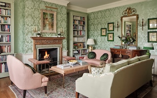
Rich chocolatey browns add depth and gravitas. “I enjoy how it is a softer and prettier alternative to black and grey,” says interior designer Louise Robinson. “I find the right shade of brown will go with almost anything and I enjoy how it can bring an unexpected warmth and softness, both when used in its natural form such as dark wooden furniture, but also in other finishes, including patterns, paints and floor tiles.”
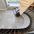
This is a colour that can act as an effective textural base, from oak parquet to sisal flooring, or as a canvas, such as an exposed brick or micro-cement wall. As a painted finish, it comes alive when paired with other earthy tones. “As a rule of thumb, colours that work in nature also work well in the home,” says Benjamin Moore‘s Helen Shaw. “So, combinations such as brown and green feel nourishing and soothing, while dusky pink and pale-mid blue contrasts lend an airy, harmonious atmosphere.”

Drab to dramatic: Reimagining brown
These days, brown has shaken off its utilitarian, paper bag image. “We probably need a complete change of language as we explore the full-colour range,” says TH2 Design‘s Sheila El Hadery.
“Cacao, espresso, cappuccino, toffee, peat, tobacco, tan, bronze: the right tones have no dreary connotations. Dark chocolate velvets are inviting on sofas, caramel and almond linens conjure a feeling of quiet luxury and peaty timbers provide depth and warmth. At the other end of the spectrum, when paired with ivory and used as a glossy lacquer finish in combination with bronze metals, brown can inject a deeply luxurious and glamorous feel.”
Dark furniture too has fallen out of favour in recent years, but reframed in a new context, it has a reassuring, noble quality. “It is slowly making its way back into the spotlight,” believes Neptune‘s Simon Temprell.

“Unlike the wenge wood of the 1990s, today’s furnishings are lighter and warmer, introducing a sense of heritage and history. Try allowing natural timbers to speak for themselves, without getting too hung-up on everything in the room matching. Textural fabrics like velvet and tweed, plus black-bronze hardware and finishes on cabinetry and lighting are all good foils.”
If mid-century or 1970s pieces are appealing, introduce these elements with a light touch. “Lean into selecting vintage furniture with timber frames, but vary your furniture finishes and styles to create a more timeless approach,” suggests Elicyon‘s Holly Beazley.
“For example, pair a 1970s timber chair with a contemporary lacquer table in a pop of colour to vary styles and finishes. In a recent project, we used high gloss cherry red timber chairs piped in yellow and upholstered in a blue and white patterned fabric. They brought a touch of the unexpected into an otherwise formal dining space.”

This is a tone that can be smart and sophisticated or natural and earthy. “It acts as a fabulous foil to orange and yellow,” says Otta Designs’ Alexandra Keith. “Artwork also pops against a backdrop of warm mid-tone browns. We have recently used Edward Bulmer’s Clove in a country house project to great effect.”
Perfect pairings for contemporary interiors
When it comes to decorating, the formality of classic wood can be instantly contemporised by the right colour combinations. In kitchens, walnut cabinetry partners beautifully with raspberry or plaster pink, sky blue or mustard yellow, while dark wood joinery paired with burgundy accents lends a cosy feeling to snugs. Introducing texture in brown joinery brings energy and verve, whether a fluted finish on cabinets, bars and room dividers or scalloped wooden shelving.
Painting with brown can produce either dramatic or subtle effects depending on context. “The best paint colours to pair with it depends on the light in the room, the effect you want to achieve and your personal style,” advises Mylands’ Dominic Myland.

“Contrasting brown with black tones can create a striking modern interior, while combining it with a warm off-white or pastels will give it a much lighter appearance. Pay attention to a brown paint’s undertones: most will have hints of red, umber or yellow, and so pair better with warmer shades of white with a hint of yellow, rather than cooler-based tones.”
For timeless appeal, Emily Brooks suggests pairing a golden brown like Paint & Paper Library’s Caddie with a Dorset-inspired hue like Farrow & Ball’s Lulworth Blue. “A powdery blue is like a breath of fresh air against the steady ground of brown,” she says.
“This is a perfect pairing in rooms filled with daylight, generating both a grounding and calm atmosphere. Introduce pattern with a checked tile, veiny marble or striped fabric. Choose brass fixtures and something floaty to freshen the look - I always add a linen cafe curtain or tablecloth to soften a brown kitchen or scullery.”

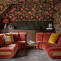
Living rooms in a soft tobacco finish have subtly sophisticated appeal. Tones like this have a lived-in, almost 1940s feel, lending a scheme warmth and atmosphere, particularly in period properties with gracious architectural features. “I’d pair brown walls with yellow ochre, burnt orange, olive green or aubergine-plum via curtains, furnishings or other accents,” suggests Brooks.
“The effect is an analogous scheme that is both opulent and anchoring.” Interior designer Paolo Moschino uses several shades of brown as a failsafe option. “I often turn to this colour in my schemes because I associate it with warmth, comfort, and stability,” he says. “It has a classic and timeless quality because it doesn’t go in and out of fashion as quickly as some other colours. In both decoration and my personal wardrobe, brown and blue is a go-to combination.”

Timeless and versatile
Often underestimated for its power and longevity, brown is slowly inching towards the spotlight again. “Thanks to its subtle, warming, and luxurious qualities, I predict that we will be seeing much more of this hue across design, interiors, and even fashion over the upcoming seasons,” says Studio Lodha‘s Blandine de Navacelle.
There is no doubt that in periods of uncertainty, hues of earthy bronze and rich mahogany hint at the consistency of the elements, of wood and of nature - and all the reassurance that they offer.
More from Design Ideas


More from The English Home