The evolution of checks in interior design: History, trends and decorating tips
We explore how trends and historical influences have shaped British interiors, this time examining the enduring appeal of checks.
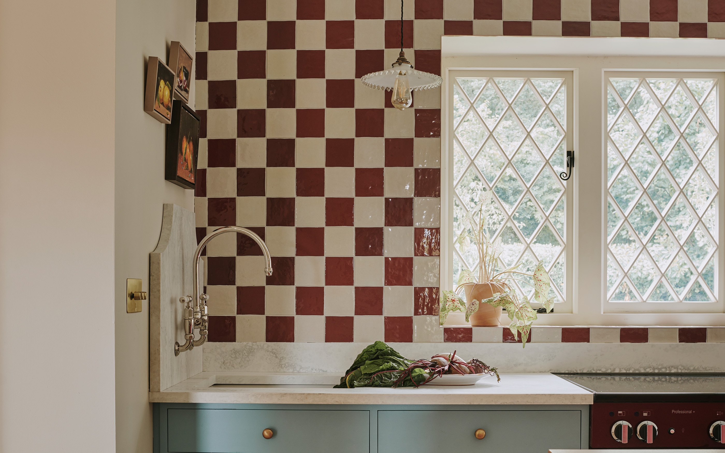
Deriving from the ancient Persian word ‘shah’, which means ‘king’ in an early form of chess, checks have been a decorative staple in interiors and fashion for centuries.
The chequerboard pattern has been identified in Bronze Age pottery as well as in Roman design, and its usage remains familiar on chess boards, in weaving and via its popular variant, tartan. In fashion, checks remain a perennial motif, from the lining of Burberry’s coats to chic decorative emblems on suits and skirts.
Its formation is repeated in architecture, too, in the form of bricks or tiles in varying tones or materials. Inside, chequerboard floors, particularly in monochrome, are a decorative staple of Victorian hallways.
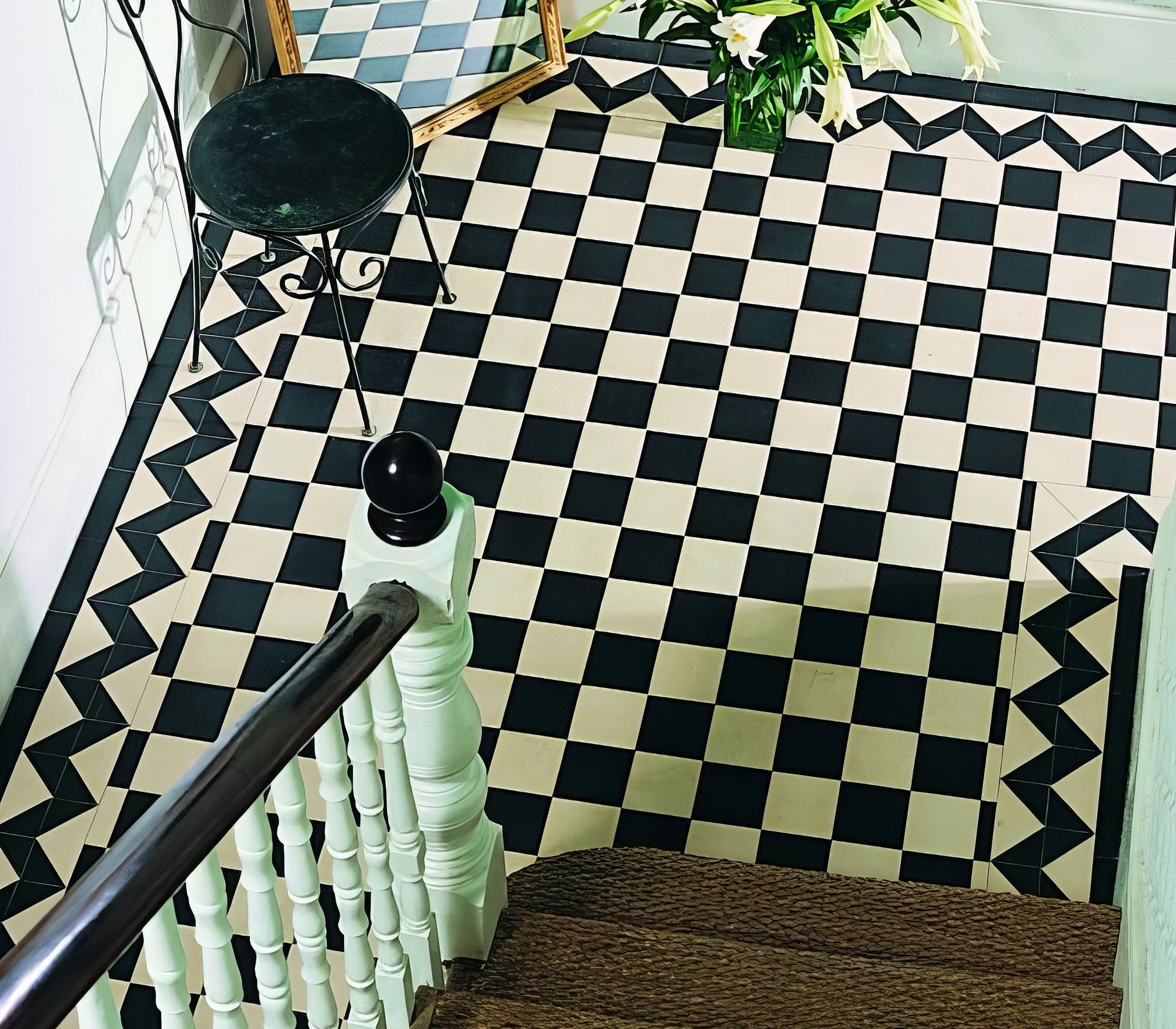
Like stripes, checks are ‘repetitive and harmonious to the eye, which has the effect of being reassuringly grounding. This pattern can bring both rigour and dynamism to a scheme, making it a timeless addition to interiors.
A pattern that transcends time and style
Few patterns have transcended genres more successfully than checks, from tartans and plaids to ginghams. Their appeal extends beyond rustic chic and into modern schemes, thanks to evolving colourways and playful scales. They have a timeless quality that speaks of a bygone era, while their simplicity ensures they can easily complement a contemporary scheme.
“I enjoy the comforting character of checked fabrics,” says interior designer Nicola Harding. “They are a brilliant way of adding depth and pattern. You can layer them on top of each other or you can use them alongside more detailed or complicated patterns to create a sense of contrast.
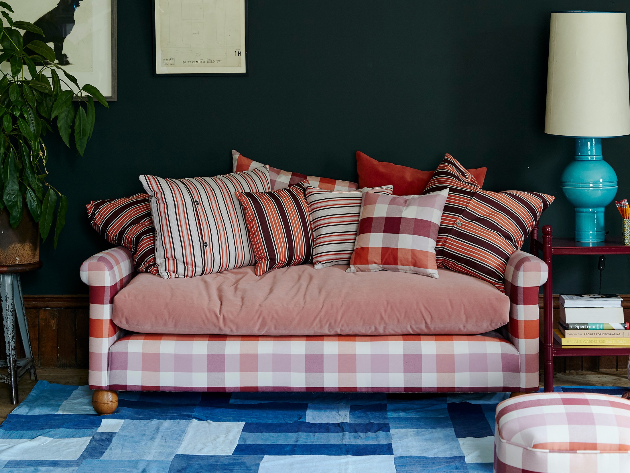
Traditionally seen as utilitarian fabrics, checks, along with ticking, used to be consigned to the role of lining fabrics in previously back-of-house areas such as kitchens. Now they are taking a more prominent role as our homes become more relaxed and sturdy fabrics are applied to everything from sofa upholstery and drapery to duvet covers and bed skirts.”
The versatility of checks allows for the option of a bold pattern in strong statement colours or a subtler design that will provide a textural backdrop and allow other features to stand out. They can be used across multiple schemes, from kitchen splashbacks to an upholstered bench.
Styling checks: scale, colour and placement

The key is to consider scale, colourway and whether they are to be paired with plains or other patterns. “From curtains and blinds to antique stools and chairs or gathered within cupboard doors, checks (along with their brother, the stripe) perfectly balance a patterned scheme, often delivering a more masculine contrast to a feminine floral, believes designer Octavia Dickinson.
“They are also useful when one needs to keep an eye on costs, due to their simple design. In that respect, they are a great choice for curtains or a bed valance where copious fabric is needed.”
Though checks evoke a certain nostalgia, a larger, crisper scale of this repeat strikes a fresh, contemporary air. Generous checks are bolder and can be used as a statement piece within a room, says interior designer Susie Atkinson. “Smaller checks are great as accents and less dominating because they can often be read from afar as a plain.”

Architectural impact of checks
This pattern is a great way to add rigour to a scheme, injecting an easy sense of modernity if used unexpectedly. It can bring playful gravitas to the architectural features of a room by lining the inside of a fireplace with checked tiles, framing windows with a wide checked curtain fabric, or adding a check tiled wall above a kitchen counter or around a chimney breast.
How checks pull a room together
Checks serve these ‘backbone’ elements well because they introduce a softly graphic note that can pull a scheme together. “We recently upholstered an octagonal ottoman in a bold check,” say Hutley & Hum’s Melissa Hutley and Charlie Hum. “It added visual impact and featured all the colours within the scheme, so it was an excellent way of bringing everything back to the centre of the room. Stripes, checks and other patterns can sit together well as long as the colours are in the same tonal family.”
Flooring, walls and bold tile moments
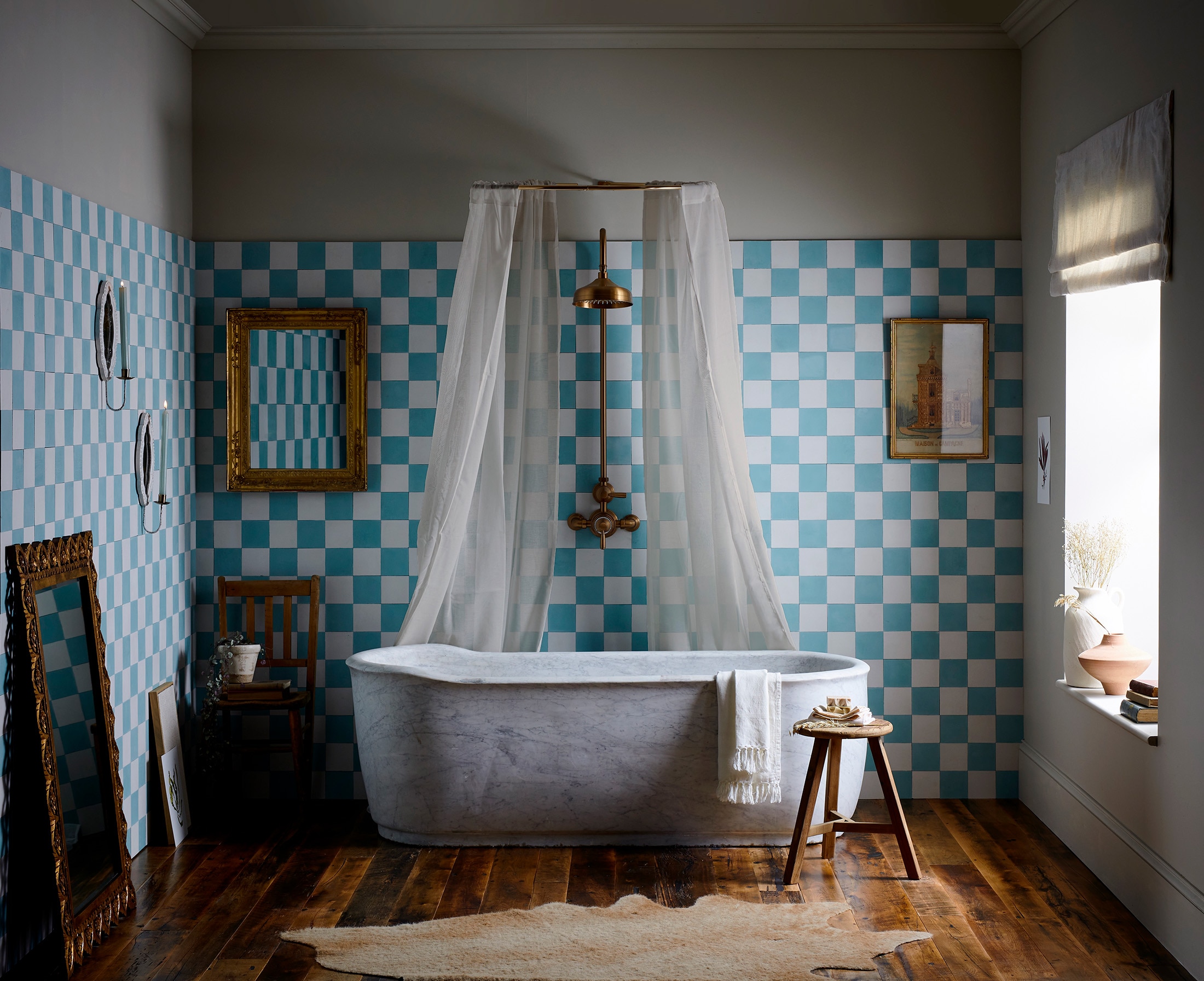
Of course, checks are also a natural choice for floors and walls. Experimenting with tile placement, such as a diagonal arrangement, introduces a sense of movement and adds a modern touch to a classic motif. “Smaller patterns create a more detailed and intricate design that works well as a feature wall in the bathroom or as a kitchen splashback,” says Bert & May’s creative director, Lee Thornley.
“Alternatively, bold checks in contrasting shades create a feeling of drama and energy and serve as an eye-catching feature.”
Floor coverings and wallpapers both create a surprisingly liveable backdrop, with wider, plainer checks on the wall often helping to make a space feel bigger. “We also use them in our checkered jute collection of rugs,” says Tate & Darby‘s Kirsty Darby.
“Combining hardwearing jute with a brightly coloured check adds an unusual injection of colour, making practical flooring feel contemporary and fun.”

Supersized checks: A contemporary comeback
Playing with scale is a great way to contemporise this look, and, recently, super-sized checks have returned to the spotlight. Interior designer Beata Heuman‘s Jumbo Gingham is a bold but neutral fabric that pays homage to traditional Swedish interiors and looks impactful on a chair or long bench. Salvesen Graham‘s winning combination of frills and checks, including their Great Check cushions, adds a playful element to bedrooms.
An unexpected hit of this pattern keeps the look modern too. As well as scaling up the repeat, choose unusual settings such as all four walls of a cloakroom.
Unexpected ways to use checks

Or consider a headboard upholstered in gingham. “I also like to use a check on deep buttoning; it throws it into more abstract design,” says Violet & George‘s Nicky Mudie. “Another option when upholstering is to flip the checks from straight in one area, onto the bias adjacent so the repeats clash for a more dynamic look.”
Though classic monochrome never goes out of fashion, brown and white, yellow, pink and green are all elegant options. “We recently used our new Woodman check in Berber Brown in Veere’s new London apartment,” says Veere Grenney‘s Natasha Greig. “It’s a crisp brown-and-white cotton windowpane check, which we used on his bed and curtains, complemented by chocolate-coloured Alpaca walls. The room is handsome, tailored and cosy.”
Chequered patterns can work with more intricate options, as long as there are pause points in the scheme for the eye to rest. Interior designer Sarah Peake recently used yellow and white zellige tiles for a bathroom in a London pied-à-terre to act as a foil for ornate floral floor tiles. “It worked because the two patterns were broken up by a plain white bath, so did not jar,” she says.

A pattern with fashion roots
As ever, fashion feeds into the perennial appeal of checks. “I really like the colours and combinations from the 1930s to the 1970s,” says La Manufacture Cogolin‘s Sarah Henry. “Not brown and orange or the space-age colours of the 1950s, but haute-couture fashion hues from the period. There are really interesting greens and pinks and Bordeaux tones that we don’t see as much in current design. I find that combining bolder tones - such as yellow and turquoise instead of black and white - can lend a more contemporary look to a traditional check.”
Sometimes all that is needed is a small touch, whether using a tartan or checked wallpaper on the back of bookshelves, or as Bennison‘s Louise Laycock suggests, introducing checks on the back of dining chairs to add interest in an unexpected place, or to edge a pair of curtains. “I like to work with warm colourways such as pink, coral, yellow and ochre,” she says. “Everything looks better with a warm backdrop.” Simple and honest, yet eye-catching and informal, this is a pattern with enduring appeal.
More from Design Ideas
More from The English Home
