The art of mixing patterns: Expert interior design tips for balance, colour and creative harmony
Experts reveal the secrets to pattern success from quiet touches to joyful exuberance.

Whether mixed or matched, pattern is what leading interior designer Kit Kemp describes as ‘sheer delight’.
‘It brings a space to life and elevates it with personality, injecting a sense of rhythm, joy and spontaneity, she says. ‘I always say a room should lift your spirits, and pattern is so often the magic ingredient that does just that.’
While there are numerous ways to work with pattern in a room, there are techniques to help make combinations sing. Here, designers reveal some of their favourite secrets of success.
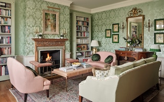
How to ground a pattern-heavy room

‘To achieve balance in pattern-heavy interiors, I follow the golden rule of anchoring the space with substantial, solid-coloured furnishings that provide a necessary visual rest, explains Brian Woulfe, founder and director of Designed by Woulfe. This technique can be used, as Woulfe has done, with a large modular sofa in solid rust-coloured velvet to balance immersive pattern from an ‘all-over’ wallpaper. Or it can be used across several armchairs and sofas, in different solid shades, to echo and contrast with a variety of colours found in the pattern in the room.
Expert tips for combining different patterns
One of the best ways to add charm and individuality is to mix patterns - on upholstery, curtains and walls. They can be used to add layers and dimension by creating movement within a room, making it rich and inviting rather than flat or formulaic. But it can be tricky to get it right.

Kemp recommends layering bold, vibrant patterns to achieve a unique, whimsical yet cohesive look, approaching a room as it if it is a canvas.
‘It is important to begin with a neutral base that will anchor the patterns, adding in bolder tones for a more daring look’, she explains. ‘We often start with a plain or subtly patterned backdrop for larger surfaces such as walls, so that the base colour allows the patterns to stand out without overwhelming the senses.’
Matching patterns for a cohesive look
Another pattern-mixing secret is to vary the scales, to avoid a messy or overwhelming look - something that can happen with two very similar patterns.

‘Pair large, bold patterns with smaller, more intricate ones?’ continues Kemp. ‘For instance, cover walls with a large-scale floral or pictorial design and complement them with sofas and armchairs in an intricate geometric weave. This creates a more balanced feel, so that the eye can differentiate areas, and especially effective when bold prints are combined with some solids or simpler patterns to provide breathing space.’
Think, too, about creating a sense of movement by using a meandering pattern next to a more static one. ‘A bold stripe beside a delicate floral or a pictorial print next to an embroidered motif create moments of surprise that give a room charm and individuality, she says. ‘Patterns can reflect memories, cultures or far-flung adventures, when layered thoughtfully.’
Matching patterns for a cohesive look

Another effective option is to match two patterned items in a room scheme, such as the same bold fabric on two armchairs or on a headboard and sofa. This is another way to anchor and unite an interior, creating a sense of cohesion amid other decorative elements.
‘This is usually more successful when there is a good, clear area around the patterned furniture for the effect to have impact, says interior designer Sarah Vanrenen.
These contrasting areas really do help to make pattern stand out and bring variety to the space.
The power of pattern-on-pattern design
Using matching pattern can be highly successful, as Caroline Inchyra, founder and creative director of fabric and wallpaper house Inchyra, explains. ‘It’s the fabric equivalent of colour drenching with paint- and it really packs a punch’, she says. ‘If there’s a golden rule to this style of decorating, it has to be that it won’t be effective unless you fully commit.’

While it might feel brave to work with an overall matching scheme, it can add to an enveloping feel, which can be especially effective in a cocooning bedroom, for example. Inchyra’s advice is to work with one design or derivative designs from one source, intended to be used together: ‘If you are working with a single design, which I suggest be a medium-to large-scale floral or floral-based pattern that you absolutely love and that will be easy to live with, then just go for it.’
Make sure the pattern is available in fabric and matching wallpaper or use fabric for walling. ‘Use it for every surface application in the scheme and introduce variety in how you use the fabric: add gathers, frills or buttoning, for example,’ she adds.

Another option is to pick fabrics designed as a co-ordinating collection, allowing opportunities for confident combinations of pattern, usually with one colour story. ‘With this approach, you can go bold with the hero design and then introduce additional layers of pattern, but make sure the hero design is used heavily, advises Inchyra.
How to tie patterns together with a unified palette
An effective way to mix a host of patterns is to identify a common element, such as a colour, and use it to tie the whole room together.

Interior designer Penny Morrison recently combined a host of patterns - all in red - in a bedroom scheme. ‘Pairing red with clean white gives a modern yet understated look, with the varying pattern scales allowing the eye to dance around the room, rather than one single element dominating, she explains. ‘Red can be an overpowering colour, so breaking it up with pattern softens it while retaining a splash of colour.’
Note, too, that Morrison mixes both scale and type of pattern: geometric motifs are combined with florals and animal prints, creating an eclectic yet harmonious look. Bring a combination of patterns together on a mood board and see how they work together and play with swatches until the selection feels right.
Using stripes to add energy and playfulness

Striped fabrics can be used to add a playful touch to any room: try contrasting horizontal and vertical stripes or different widths. ‘The key to making stripes work is to play with scale and texture’, advises designer Birdie Fortescue, who contrasted fine vertical lines in curtains with the broader, more relaxed stripe of a jute rug. ‘The slightly unexpected combination of these stripes creates gentle visual interest and character that feels intentionally layered rather than busy’, she notes.
‘By keeping the colour palette cohesive with deep burgundy and soft neutral tones running through both curtains and rug, the room feels considered and intentional.’
More from Design Ideas


More from The English Home